 |
||
 |
Pros: Great new workflow enhancements, ProChannel is stellar, better drag-and-drop, gorgeous interface, unified tools |
|
 |
Cons: Strange removal of menu editor, interface issues with fitting everything on screen, a couple of rough edges |
|
|
Summary: |
||
I'm a host whore. I admit it. I've tried and used most audio/MIDI hosts that exist, switched between hosts multiple times, and typically use at least two different hosts in the course of a day. And there really are several great hosts out there. The problem? Nobody gets it "just right" for me. It seems that every time I find a host that does what I want, the interface doesn't do it justice. Every time I find a beautiful interface, the host doesn't do what I want.
I'm a longtime fan of Cakewalk SONAR. So when I heard that Cakewalk was putting a new face on an already very complete host, I admit I got a little teary inside. We'll look and see if SONAR's latest incarnation mixes the best of both the workflow and features world. Gosh, I sure hope so………
Nuts And Bolts
Ok, so SONAR is a very large application. There is no way we can talk about everything, so we will put our focus on what is new with special mentions of past features improved, or those we feel are indispensible.
SONAR remains a PC only application, and supports Windows XP in 32-bit and both Vista and Windows 7 in 64-bit/32-bit. In all, if you install all the content, you'll find about 15GB of hard drive space being taken. Everything is optional, of course. SONAR comes with a very complete, and almost exhaustive number of instruments and effects.
Just Another Pretty Face?
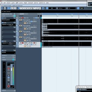
Ok, so in case you have been in a cave lately, the biggest change in SONAR X1 is in the interface. The majority of the GUI is completely new, and the rest has been refined.
SONAR X1 now features a flexible interface system called "Skylight". Not only have the graphics themselves been overhauled, but the way windows and menus are organized is overtly different than the previous version. Some elements remain similar to previous versions, but are adjusted just enough to fit the new paradigm, such as the piano roll and waveform display.

On first launch, I found the interface to be much too "big" for my tastes, at least on my laptop. Many elements have increased in size, such as mixer strips and most buttons. If you're working on a laptop, you may find it harder to fit as much on your screen as before. However, if you're working on a larger monitor, the interface looks spectacular. Very clean, very organized, and very easy on the eyes.
Working from the top, you'll find a brand spankin' new toolbar/control bar area. It's clean, it's slick…….and it's bigger than before. It's actually downright sexy. Instead of the constant row of buttons from before, you now get a series of modules to display.

Everything from the Markers module to the Playback module to the ACT module and more. You no longer have the ability to select exactly which buttons appear, which is a real bummer. What makes this fact worse is that you can't actually fit all the modules on screen unless you have a 24" monitor(yes, really).

So you need to pick and choose which modules are most important(you probably won't use them all).
You can change the order of these modules as well. However, due to some modules remaining off screen, you can't move those modules because you can't see them to grab! You can choose to dock the control bar at the top or bottom of the screen, or you can float it.
You now have much more flexibility in how you display various panels, namely in the way they are docked. For instance, the bottom Tabbed Views which has been present in previous SONAR versions has been replaced by the new MultiDock, which now has the ability to cover the entire bottom of the screen. Before, it was restricted to just below the clips pane. The MultiDock can still house a number of SONAR windows, from the Console view to the Matrix, and more. And all these views can be individually floated, if needed, as before. Or the entire MultiDock can be floated to put on a second monitor or anywhere else.
You now have a right and a left side docking area as well. By default, the left dock contains the all-new Inspector area, while the right side dock contains the browser. The Browser has Media, Plug-in, and Synth Rack tabs. You can dock both on either side of the screen, or both on the same side at the same time, however you would like. Also, the Browser can be docked in the multi-dock as well.
Each side docker can be either docked to cover the entire height of the screen, or they can be made "shorter" to let the MultiDock extend to the edge of the screen. This is a very good thing.

Finally, all docks can be collapsed to save some space, or they can be floated or hidden. Though I wish they were a tad bit more compact when collapsed, I'm really being overly picky by even mentioning it.
 One part of the interface that I have mixed feelings about is the new Edit Filters. Each track has a dropdown menu where you can choose whether to show clips, notes, automation, Audiosnap transients, or other information. This really helps to clean things up a bit. The part that kind of brings it down is that you can only view one type of information at a time. So you can't move a clip while editing Audiosnap transients, for instance. This is only a minor thing as all information is only a click away. And with automation, even though only one envelope can be "on top" at once, you can shift-click to access the other curves underneath. So really, very minor, and it does help to keep things tidy.
All-in-all, Skylight is a very refreshing change to the GUI of SONAR. You have much more flexibility than before, despite a few gripes. I can't say that I would want to go back to SONAR 8.5 after trying Skylight though. It's clean, has a much better layout, and just looks worlds better than previous versions of SONAR. I do hope they continue to develop and refine everything, but this is a direction that SONAR needed to take, and I'm so glad they did. It's a step in the right direction, at least for me.
Inspectorific
 The Inspector has received a major, inside-out makeover. Not only in looks, but also in how much info is displayed. You still have the ability to see the mixer channel of the track that is selected with everything from levels to pans, sends, mute/solo/record, automation, and more. But you can also see a second channel(if you choose) that shows the controls for the destination of the selected channel. It may be a bus you're sending your output to, or it may be the master output. You can choose to not show this second track if you prefer. In addition, you can switch between the audio and MIDI related controls for your track if you're using, say, an Instrument Track.
You'll also find several items that have been moved to the Inspector from the tracks pane, such as the arpeggiator. You have full access to groove information, all Audiosnap information for both clip and track, effects for both selected clip and track, and more. You can control clip and track colors, assign automation modes, and much more. Most of these things are displayed as an overlay that can be shown or hidden.
You also have access to ProChannel for the selected track(we'll talk about that in a minute).
If you're coming from an earlier version of SONAR, it really is a huge step up in terms of what is available. You can hide or show whatever information you want. It's clean, and you'll probably want it open much of the time.
Unfortunately, the Inspector also suffers from the lack of scrolling. And once again, on a laptop you can't see all the information from the mixer channel if you have all the modules showing. This becomes especially annoying when trying to use the ProChannel, as you can't even access part of it's interface on a normal laptop resolution. You can use the compact EQ view in ProChannel to bring most of it into view, but you then lose EQ knobs and still won't be able to see the switcher for the compressor module. Since this is available in the mixer, this issue may or may not be a big deal to you, but it's worth mentioning.
Once again, this is a big step forward for the Inspector, only marred by some minor headache-inducing issues.
Browse This
On the right side of the screen(by default, though it can be moved) is the new and improved Browser. Here you can do everything from browsing the media files on your hard drive to inserting plug-ins.
The latter is one of the highlights for me as you can finally drag plug-ins into your project without using a menu of any kind! And you still have the ability to edit your plug-in lists, same as with previous versions.

You can filter plug-ins based on instruments, effects, MIDI effects, and more so you can see only what you want to see.
You can also drag things such as track templates directly into your project, and even drag entire PROJECTS into your project, which is an excellent addition. The one thing I found missing is that you still can't drag an instrument over a current Instrument Track to replace the current instrument.
You can audition audio and MIDI files, as well as REX files. You can select which track or bus to audition the files through as well, same as before. However, there is no volume control for auditioning audio files. You will have to use the volume fader on the preview bus if you need to change the levels. This is unfortunate.
You can now audition REX files and load them in your project, even in 64-bit mode because of the built-in wrapper. So this is a nice touch.
The Synth Rack takes on a more compact form when docked on the side, and stretches to full size on the MultiDock.
ProChannel
These days, it's all about emulation. How else will the masses experience the butter of a quarter million dollar SSL console? Well, Sonar X1 jumps on the emulation bandwagon once again with Pro Channel, an every-track insert channel strip designed around an unidentified big studio mixing board.
Pro Channel is not a plug-in, so you can't just drag it around everywhere, but instead it takes it's place in every channel automatically. It's off by default so resources are not used, but there is no need to insert it. You can access it both in the Inspector panel, as well as next to any track in the mixer.

On Pro Channel, you'll find a compressor with both a "UA 1176" mode as well as a "4K" mode (SSL 4000 model). Both sound great, with plenty of character if you push them just a bit. The sound is clear but obvious, and can be referred to as "shine" or "glue", depending on which model you choose. Both models are accurate in the flexibility of their settings (i.e.- limited ration presets on the 1176 emulation), and you'll even find the signature SSL knob design on the 4K model. One nice touch on both of these models is that Cakewalk have included a wet/dry knob to use for parallel/New York style compression.
Next you'll see a 6 band EQ with its own mixture of models; Pure, Vintage, and Modern. Each model contains four bell-curve bands, with the top and bottom also available as shelving bands. In addition, there is a hi-pass and lo-pass filter attached to the EQ, with several filter orders each.
All three models have their own sound, though they remain fairly subtle so you aren't exactly overthrowing your original audio. The display is a little smaller than if you were to use a dedicated EQ plug-in, but there is absolutely plenty of variation and flexibility here that it is entirely possible you won't need another EQ plug-in. Whether you want clean or softly nudged towards vintage, the ProChannel EQ shines.
Speaking of shine, the entire EQ section is finished off with a "Gloss" button. Yes, they actually gave it that name. And what does it do? Simply put- harmonic massage. It's hard to explain what it does, but it's more of a "quick results" button than it is an "everything will sound better automatically" button. Use it if you need enhancement.
The last part of ProChannel is where you'll find the Tube Saturation module. There are two saturation modes here, both with slightly different flavors. I have no complaints with either one. If you like to use a bit of saturation, it does sound very good. Not much flexibility is present, but what it does, it does well.
You can change the routing order of all three modules in ProChannel, as well as turn on or off any module you wish. This is a great addition that really takes ProChannel from a "sure, I may use that" to a "I love using it" mindset. Really, it's the simple things that impress me, I know.
ProChannel is a welcome addition to SONAR, and though I'm not a fan of putting too much focus on added plug-ins on new host versions, ProChannel is flexible enough and sounds good enough that I think it's worth checking out. Even if you already have your set signal chains and the best plug-ins out there, ProChannel will likely impress. This isn't just fluff thrown in the mix, but a true way to help your mixes come to life and come together.
If you want to stay clean, ProChannel can do that. If you want to mess things up a bit with total saturation, ditto. And the fact that it's only a single button press away for any channel? Bonus.
Tools Of X1
The tools in SONAR X1 have received an overhaul as well. Not necessarily in the functionality of the tools, but in how they are accessed. You now have a Smart Tool, which lets you access many functions without having to actually switch tools. You could do this before slightly, but it's taken to a different level here.
 You still have your Draw tool, Stretch tool, Erase/Mute tool, and more, and all can be accessed either by selecting the proper tool from the Tools Module on the Control Bar, or by a middle mouse click(or the "T" shortcut) anywhere on the screen, which will bring the tools palette up right next to your mouse. This lets you select a new tool if you need something specific, without having to move your mouse away from editing.
In the Tools popup, you can also change the duration of drawn events, as well as change which type of data is showing on the track you're trying to edit(Edit Filters- explained above).
The best thing about these tools is that they are completely consistent across views. Each tool will perform the same whether you're editing clips, MIDI, notation, or anything else. So it's nice to see Cakewalk add the extra bit of cohesion to the toolset that was slightly off before.
The Random Good, Bad, And Ugly
There are many smaller or unadvertised items that you'll find in SONAR X1.
Screensets have seen an overhaul, and are no longer buried deep in an unassigned macro shortcut menu. Now you can save your entire layout and access your layout presets using the Screensets Module on the Control Bar, or with key commands. It's so much easier than before, though you do only get 10 slots to use.
 Cakewalk have slipped in a couple of extra plug-ins that you won't find anywhere being advertised. Most notably, the Cakewalk Studio Instruments, which includes strings, drums, bass, and electric piano plug-ins. These aren't exactly world beaters, but are definitely sufficient for low CPU, scratch track purposes. I was happy to see them included though, as I'm an instrument freak.
Performance in SONAR X1 actually improved on my machine. Not by a large amount, but at least a noticeable amount. The audio engine apparently has not been touched, but according to SONAR developers, the graphics take up less resources. And I think it shows, at least on some machines.
Unfortunately, there are a few issues that I hope get addressed, and a couple of things that just confuse me. I don't consider these to be showstoppers, but I feel they do need mentioned.
You can no longer edit your menus(outside of your plug-in menu layouts, which remain as flexible as before). I find this a strange omission because this was a very powerful customization method. The menus ARE better organized and clutter has been virtually eliminated. But if you've been working with previous versions and have gotten used to your own custom menu structures, you'll be slightly disappointed to find that you can't use them any more.
You also can't really control the color scheme in X1 the way you could before. The editor is still there, but most settings don't actually work. I love the new X1 default scheme, but it would have been nice to be able to at LEAST adjust things like saturation and hue.
Some buttons have been moved from the Control Bar to the Inspector. Some snap settings, for instance, are only accessible now through a key command or right-click menu. And the compact mixer strips lack things like phase flipping, which you will now find in the Inspector(and it's still there on the full size strips). This seems to be partially to help with cleaning up, and partially because most buttons are larger than before and there just isn't room for everything.
I don't know if there is a proper way to address some of these issues as they seem to be done for specific reasons, but I would like to see some attention given to refining the experience, as only a small amount is needed to make SONAR realize it's true potential.
Moving Forward At The Speed Of X
SONAR X1 is a significant upgrade to previous versions of SONAR. The new interface is beautiful, and the workflow enhancements are superb. This is truly something I've been hoping for in Sonar.
The ability to do more dragging and dropping and docking and adjusting just makes me smile. It's very slick in its presentation, and it's solid in practice.
Unfortunately, it seems like SONAR X1 is about 95% there, and the extra 5% could really make the application shine. The brain-bashing removals such as the menu editor just don't seem to have an explanation, and having no ability to scroll some areas to access all your controls can be a head-scratcher. So you'll have to decide if the issues I've mentioned are enough to make you hold off or not.
For me, I think the good far outweighs the bad in SONAR X1. I expect bumps in the road any time you completely revamp a major part of any application, and SONAR has some bumps. But when you look at the flexibility in the interface, the great sound of ProChannel, the general cleanup and refinement of tools and other key areas, SONAR X1 is a solid piece of kit that should at least get your attention.
If you're a previous SONAR user, and you've been waiting for the day where things get cleaned up and polished, your wait is over. Cakewalk has taken major strides in the area of interface and workflow. If you've never used SONAR before, X1 would likely be the best time in recent memory to try it. If you can get past the issues mentioned in this review, SONAR is going to treat you rather well.
Website: http://www.cakewalk.com
Price: List- $499, Street- $399
Test System(s): Windows 7 64-bit Professional, Custom built Intel i5 Quad Core, 8GB Corsair DDR3 RAM, 750GB Seagate Barracuda SATA System drive, 1.5TB Seagate Barracuda SATA Samples drive, Focusrite Saffire Pro 24, Keystation Pro 88, Edirol PCR-M50